Wolfram Function Repository
Instant-use add-on functions for the Wolfram Language
Function Repository Resource:
A checkbox-type control styled as a colored toggle slider
ResourceFunction["OnOffToggle"][Dynamic[arg]] represents a toggle switch with setting arg. | |
ResourceFunction["OnOffToggle"][Dynamic[arg,fn]] represents a toggle switch with setting arg and update function fn. |
| "Interaction" | "Click" | whether mouse click or mouse drag actions are required |
| "OffBackgroundColor" | LightGray | background color when False |
| "OffColor" | Lighter[Red,0.2] | toggle color when False |
| "OnBackgroundColor" | LightGray | background color when True |
| "OnColor" | Lighter[Green] | toggle color when True |
| FrameStyle | None | style appled to the toggler frame |
| ImageSize | 40 | horizontal size of the toggler |
Create an interactive switch that can be toggled with a mouse click:
| In[1]:= | ![x = False;
ResourceFunction["OnOffToggle"][Dynamic[x]]](https://www.wolframcloud.com/obj/resourcesystem/images/d03/d032db58-d705-4882-834d-dd1cb1286477/52c0a9806968b239.png) |
| Out[2]= |  |
When the control variable is True, the switch moves to the right and changes color:
| In[3]:= | ![y = True;
ResourceFunction["OnOffToggle"][Dynamic[y]]](https://www.wolframcloud.com/obj/resourcesystem/images/d03/d032db58-d705-4882-834d-dd1cb1286477/4aa569f6b0941439.png) |
| Out[4]= |  |
Two-argument Dynamic is supported:
| In[5]:= | ![t = True;
ResourceFunction["OnOffToggle"][
Dynamic[t, Function[{val, var}, var = Echo@val, {HoldAll}]]]](https://www.wolframcloud.com/obj/resourcesystem/images/d03/d032db58-d705-4882-834d-dd1cb1286477/3c94394381d95086.png) |
| Out[6]= |  |
The toggle color and background color can be individually controlled for both the on and off states:
| In[8]:= | ![x = False;
ResourceFunction["OnOffToggle"][Dynamic[x], "OffBackgroundColor" -> Lighter[Red, 0.5], "OffColor" -> Black, "OnBackgroundColor" -> Lighter[Green, 0.8], "OnColor" -> Gray]](https://www.wolframcloud.com/obj/resourcesystem/images/d03/d032db58-d705-4882-834d-dd1cb1286477/0f5743e0702210ac.png) |
| Out[9]= |  |
| In[10]:= | ![y = True;
ResourceFunction["OnOffToggle"][Dynamic[y], "OffBackgroundColor" -> Lighter[Red, 0.5], "OffColor" -> Black, "OnBackgroundColor" -> Lighter[Green, 0.5], "OnColor" -> LightGray]](https://www.wolframcloud.com/obj/resourcesystem/images/d03/d032db58-d705-4882-834d-dd1cb1286477/15e6580efdceb1a3.png) |
| Out[11]= |  |
A frame can also be styled:
| In[12]:= | ![ResourceFunction["OnOffToggle"][Dynamic[y], FrameStyle -> Black]](https://www.wolframcloud.com/obj/resourcesystem/images/d03/d032db58-d705-4882-834d-dd1cb1286477/11400e46f291438c.png) |
| Out[12]= |  |
The controller size can be set with ImageSize:
| In[13]:= | ![ResourceFunction["OnOffToggle"][Dynamic[y], ImageSize -> 80]](https://www.wolframcloud.com/obj/resourcesystem/images/d03/d032db58-d705-4882-834d-dd1cb1286477/2a24e6558b528afc.png) |
| Out[13]= |  |
The controller switches state with mouse clicks, but it can be set to require dragging between states. Any position right of center is treated as True:
| In[14]:= | ![ResourceFunction["OnOffToggle"][Dynamic[z], "Interaction" -> "Drag"]](https://www.wolframcloud.com/obj/resourcesystem/images/d03/d032db58-d705-4882-834d-dd1cb1286477/6c250d104eba34de.png) |
| Out[14]= |  |
This work is licensed under a Creative Commons Attribution 4.0 International License
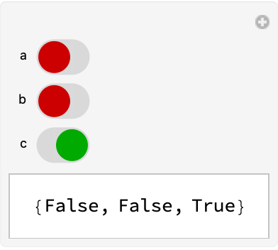
![Manipulate[{a, b, c},
{a, ResourceFunction["OnOffToggle"][#] &},
{b, ResourceFunction["OnOffToggle"][#] &},
{{c, True}, ResourceFunction["OnOffToggle"][#] &}]](https://www.wolframcloud.com/obj/resourcesystem/images/d03/d032db58-d705-4882-834d-dd1cb1286477/07c2dd90cfb64d87.png)