Wolfram Function Repository
Instant-use add-on functions for the Wolfram Language
Function Repository Resource:
Create a button that is automatically disabled when clicked and enabled when it finishes running its code
ResourceFunction["DynamicEnabledButton"][label,action] represents a button that is labeled with label, evaluates action whenever it is clicked and automatically becomes disabled while action is evaluating. | |
ResourceFunction["DynamicEnabledButton"][Dynamic[x],label,action] binds the enabled state to x. |
| Alignment | Automatic | how to align contents within the button |
| Appearance | Automatic | the overall appearance of the button |
| AutoAction | False | whether to click the button automatically when the mouse is over it |
| Background | Automatic | button background color |
| BaselinePosition | Automatic | alignment relative to surrounding text |
| BaseStyle | "GenericButton" | base style specifications for the button |
| ContentPadding | True | whether to shrink the margins tightly around the contents |
| Enabled | Automatic | whether the button is enabled or grayed out |
| Evaluator | Automatic | the kernel in which to evaluate expr |
| FrameMargins | Automatic | minimum margins to leave inside the frame |
| ImageMargins | 0 | margins around the image of the displayed button |
| ImageSize | Full | the overall image size of the displayed button |
| Method | "Queued" | the evaluation method to use |
| Tooltip | None | the tooltip for the button |
| TooltipDelay | 0.` | how long to delay before displaying the tooltip |
| TooltipStyle | {} | style specifications for the tooltip |
Create a button that automatically becomes disabled while it is running code:
| In[1]:= | ![ResourceFunction["DynamicEnabledButton"]["test", Pause[5]]](https://www.wolframcloud.com/obj/resourcesystem/images/7fe/7fec88f6-da14-4ff4-8f40-a2480f8eb405/50006b84dab09555.png) |
| Out[1]= |  |
Provide a symbol that is updated automatically as the button changes state:
| In[2]:= | ![{ResourceFunction["DynamicEnabledButton"][Dynamic[x], "test", Pause[5]], Dynamic[x]}](https://www.wolframcloud.com/obj/resourcesystem/images/7fe/7fec88f6-da14-4ff4-8f40-a2480f8eb405/3da0bf443bdd1e74.png) |
| Out[2]= | 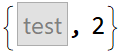 |
Use a dynamic label:
| In[3]:= | ![ResourceFunction["DynamicEnabledButton"][Dynamic[z], Row[{"Button is enabled: ", Dynamic[z]}], Pause[5]]](https://www.wolframcloud.com/obj/resourcesystem/images/7fe/7fec88f6-da14-4ff4-8f40-a2480f8eb405/72f1d4b531eb87ca.png) |
| Out[3]= | 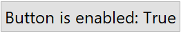 |
Embed in other expressions:
| In[4]:= | ![ResourceFunction["BirdSay"][
ResourceFunction["DynamicEnabledButton"]["awesome", Pause[5]]]](https://www.wolframcloud.com/obj/resourcesystem/images/7fe/7fec88f6-da14-4ff4-8f40-a2480f8eb405/5047170f42ea46b7.png) |
| Out[4]= | 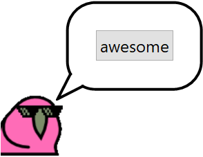 |
Control the state of the button by setting values for the given symbol:
| In[5]:= | ![ResourceFunction["DynamicEnabledButton"][Dynamic[enabled], "test", Pause[5]]](https://www.wolframcloud.com/obj/resourcesystem/images/7fe/7fec88f6-da14-4ff4-8f40-a2480f8eb405/14d0a07d26496918.png) |
| Out[5]= |  |
| In[6]:= |  |
| Out[6]= |  |
Use another control:
| In[7]:= | ![Checkbox[Dynamic[enabled]]](https://www.wolframcloud.com/obj/resourcesystem/images/7fe/7fec88f6-da14-4ff4-8f40-a2480f8eb405/1c76dbfd35cb05e9.png) |
| Out[7]= |  |
Change the label depending on the state of the button:
| In[8]:= | ![ResourceFunction["DynamicEnabledButton"][
Dynamic[doing],
PaneSelector[{True -> "Do the thing", False -> ProgressIndicator[Appearance -> "Percolate"]}, Dynamic[doing]],
Pause[5]
]](https://www.wolframcloud.com/obj/resourcesystem/images/7fe/7fec88f6-da14-4ff4-8f40-a2480f8eb405/4c539b3774403c08.png) |
| Out[8]= | 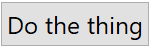 |
Create a group of buttons where only one can be clicked at a time:
| In[9]:= | ![Column[{ResourceFunction["DynamicEnabledButton"][Dynamic[z], "first", Pause[5]], ResourceFunction["DynamicEnabledButton"][Dynamic[z], "second", Pause[5]]}]](https://www.wolframcloud.com/obj/resourcesystem/images/7fe/7fec88f6-da14-4ff4-8f40-a2480f8eb405/0a604e0ee2823f0e.png) |
| Out[9]= |  |
Create multiple button groups:
| In[10]:= | ![(* Evaluate this cell to get the example input *) CloudGet["https://www.wolframcloud.com/obj/8f5fd9d1-5891-4424-9d7d-db4bc56c6cf9"]](https://www.wolframcloud.com/obj/resourcesystem/images/7fe/7fec88f6-da14-4ff4-8f40-a2480f8eb405/62c0875b82845caa.png) |
| Out[10]= | 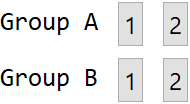 |
Use in a graphics expression:
| In[11]:= | ![Graphics[{Dynamic[If[g, Red, Gray]], ResourceFunction["DynamicEnabledButton"][Dynamic[g], Disk[], Pause[5]]}]](https://www.wolframcloud.com/obj/resourcesystem/images/7fe/7fec88f6-da14-4ff4-8f40-a2480f8eb405/46a3abc0cec973e9.png) |
| Out[11]= |  |
Display the label literally, without the appearance of a button:
| In[12]:= | ![ResourceFunction["DynamicEnabledButton"][
Mouseover["click", Style["click", Italic]], Pause[5], Appearance -> None]](https://www.wolframcloud.com/obj/resourcesystem/images/7fe/7fec88f6-da14-4ff4-8f40-a2480f8eb405/27c61b6c0afafa6c.png) |
| Out[12]= |  |
The state need not be bound to a symbol:
| In[13]:= | ![states = <||>;
{
ResourceFunction["DynamicEnabledButton"][Dynamic[states["first"]], "first", Pause[5]],
ResourceFunction["DynamicEnabledButton"][Dynamic[states["second"]], "second", Pause[5]],
Dynamic[states]
}](https://www.wolframcloud.com/obj/resourcesystem/images/7fe/7fec88f6-da14-4ff4-8f40-a2480f8eb405/695a065cdccf6b50.png) |
| Out[6]= |  |
Use the TaggingRules of the current notebook to store the button state:
| In[14]:= | ![ResourceFunction["DynamicEnabledButton"][
Dynamic[CurrentValue[
EvaluationNotebook[], {TaggingRules, "tag"}]], "test", Pause[5]]](https://www.wolframcloud.com/obj/resourcesystem/images/7fe/7fec88f6-da14-4ff4-8f40-a2480f8eb405/1231c756eab292c3.png) |
| Out[14]= |  |
Get the button state using CurrentValue:
| In[15]:= | ![CurrentValue[EvaluationNotebook[], {TaggingRules, "tag"}]](https://www.wolframcloud.com/obj/resourcesystem/images/7fe/7fec88f6-da14-4ff4-8f40-a2480f8eb405/7047ff0f3e7d3441.png) |
| Out[15]= |  |
Change the state:
| In[16]:= | ![CurrentValue[EvaluationNotebook[], {TaggingRules, "tag"}] = False](https://www.wolframcloud.com/obj/resourcesystem/images/7fe/7fec88f6-da14-4ff4-8f40-a2480f8eb405/275893d45cd1ced7.png) |
| Out[16]= |  |
To use a label of the form Dynamic[…] without specifying the dynamic binding, None can be used as the first argument to avoid ambiguity:
| In[17]:= | ![ResourceFunction["DynamicEnabledButton"][None, Dynamic[DateString[], UpdateInterval -> 1], Pause[5]]](https://www.wolframcloud.com/obj/resourcesystem/images/7fe/7fec88f6-da14-4ff4-8f40-a2480f8eb405/7e697bbf0da38f17.png) |
| Out[17]= | 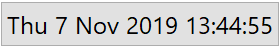 |
Different predefined alignment options:
| In[18]:= | ![Row[Table[
ResourceFunction["DynamicEnabledButton"]["y", Pause[5], ImageSize -> {Automatic, 50}, Alignment -> a], {a, {Top, Center, Bottom}}], "xxx"]](https://www.wolframcloud.com/obj/resourcesystem/images/7fe/7fec88f6-da14-4ff4-8f40-a2480f8eb405/10451dd3ed0ef3b3.png) |
| Out[18]= | 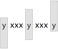 |
Predefined button appearances:
| In[19]:= | ![Table[ResourceFunction["DynamicEnabledButton"]["xxx", Pause[5], Appearance -> a], {a, {"DialogBox", "Palette", "Frameless"}}]](https://www.wolframcloud.com/obj/resourcesystem/images/7fe/7fec88f6-da14-4ff4-8f40-a2480f8eb405/21f767702b96a6ca.png) |
| Out[19]= | 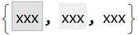 |
On some platforms, the following appearances are also defined:
| In[20]:= | ![Table[ResourceFunction["DynamicEnabledButton"]["xxx", Null, Appearance -> a], {a, {"AbuttingLeft", "AbuttingRight"}}]](https://www.wolframcloud.com/obj/resourcesystem/images/7fe/7fec88f6-da14-4ff4-8f40-a2480f8eb405/50bff8947ad6a222.png) |
| Out[20]= | 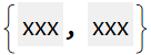 |
Use a second element to get the appearance of a pressed button:
| In[21]:= | ![Table[ResourceFunction["DynamicEnabledButton"]["xxx", Null, Appearance -> {a, "Pressed"}], {a, {"DialogBox", "Palette"}}]](https://www.wolframcloud.com/obj/resourcesystem/images/7fe/7fec88f6-da14-4ff4-8f40-a2480f8eb405/60ea6035583f846d.png) |
| Out[21]= | 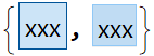 |
Use a special appearance for the button:
| In[22]:= | ![ResourceFunction["DynamicEnabledButton"]["xxx", Null, Appearance -> None]](https://www.wolframcloud.com/obj/resourcesystem/images/7fe/7fec88f6-da14-4ff4-8f40-a2480f8eb405/21aa2d30d4beb7c9.png) |
| Out[22]= |  |
By default, the button function does not evaluate until you click it:
| In[23]:= | ![x = 0; {ResourceFunction["DynamicEnabledButton"]["xxx", x++], Dynamic[x]}](https://www.wolframcloud.com/obj/resourcesystem/images/7fe/7fec88f6-da14-4ff4-8f40-a2480f8eb405/4df2b67a1f34ee90.png) |
| Out[23]= | 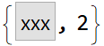 |
By setting AutoAction, the button function evaluates as you mouse over the button area:
| In[24]:= | ![y = 0; {ResourceFunction["DynamicEnabledButton"]["yyy", y++, AutoAction -> True], Dynamic[y]}](https://www.wolframcloud.com/obj/resourcesystem/images/7fe/7fec88f6-da14-4ff4-8f40-a2480f8eb405/23a82e7544d18fbe.png) |
| Out[24]= |  |
Change the background colors:
| In[25]:= | ![Table[ResourceFunction["DynamicEnabledButton"]["xxx", Null, Background -> c], {c, {Pink, Green, Gray, Yellow}}]](https://www.wolframcloud.com/obj/resourcesystem/images/7fe/7fec88f6-da14-4ff4-8f40-a2480f8eb405/7f205d2075e32ec4.png) |
| Out[25]= |  |
Change the background color on every click:
| In[26]:= | ![DynamicModule[{x = 0}, ResourceFunction["DynamicEnabledButton"]["xxx", x = Mod[x + 1/10, 1],
Background -> Dynamic[Hue[x]]]]](https://www.wolframcloud.com/obj/resourcesystem/images/7fe/7fec88f6-da14-4ff4-8f40-a2480f8eb405/1737a384a5b1cb6e.png) |
| Out[26]= |  |
Align with the surrounding text:
| In[27]:= | ![Row[Table[
ResourceFunction["DynamicEnabledButton"]["xxx", Null, BaselinePosition -> p], {p, {Top, Center, Bottom}}], "xxx"]](https://www.wolframcloud.com/obj/resourcesystem/images/7fe/7fec88f6-da14-4ff4-8f40-a2480f8eb405/1c1eead05b1e6c4c.png) |
| Out[27]= | 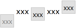 |
Change the baseline position on every button click:
| In[28]:= | ![DynamicModule[{x = 1}, {"x", ResourceFunction["DynamicEnabledButton"]["xxx", x = Mod[x + 1, 3, 1], BaselinePosition -> Dynamic[Part[{Top, Center, Bottom}, x]]], "x"} // Row]](https://www.wolframcloud.com/obj/resourcesystem/images/7fe/7fec88f6-da14-4ff4-8f40-a2480f8eb405/488cacab97ad0d4d.png) |
| Out[28]= |  |
Remove extra whitespace around a label with no ascenders or descenders:
| In[29]:= | ![ResourceFunction["DynamicEnabledButton"][xxx, Null, FrameMargins -> 0,
ContentPadding -> False]](https://www.wolframcloud.com/obj/resourcesystem/images/7fe/7fec88f6-da14-4ff4-8f40-a2480f8eb405/571ca25d8ca2fb5b.png) |
| Out[29]= |  |
By default, DynamicEnabledButton is enabled:
| In[30]:= | ![ResourceFunction["DynamicEnabledButton"]["aaa", Null]](https://www.wolframcloud.com/obj/resourcesystem/images/7fe/7fec88f6-da14-4ff4-8f40-a2480f8eb405/74fa527153fd577f.png) |
| Out[30]= |  |
By setting Enabled→False, the button is disabled but visible in its current state:
| In[31]:= | ![ResourceFunction["DynamicEnabledButton"]["aaa", Null, Enabled -> False]](https://www.wolframcloud.com/obj/resourcesystem/images/7fe/7fec88f6-da14-4ff4-8f40-a2480f8eb405/226995c7c829df33.png) |
| Out[31]= |  |
By starting the button with Enabled→False, the button can still be enabled manually by altering the given symbol:
| In[32]:= | ![ResourceFunction["DynamicEnabledButton"][Dynamic[aaa], "aaa", Null, Enabled -> False]](https://www.wolframcloud.com/obj/resourcesystem/images/7fe/7fec88f6-da14-4ff4-8f40-a2480f8eb405/29c8953cf52a97a6.png) |
| Out[32]= |  |
| In[33]:= | ![Checkbox[Dynamic[aaa]]](https://www.wolframcloud.com/obj/resourcesystem/images/7fe/7fec88f6-da14-4ff4-8f40-a2480f8eb405/3e117c63f938dd6f.png) |
| Out[33]= |  |
Use preset values:
| In[36]:= | ![Table[ResourceFunction["DynamicEnabledButton"]["xxx", Null, ImageSize -> i], {i, {Tiny, Small, Medium, Large}}]](https://www.wolframcloud.com/obj/resourcesystem/images/7fe/7fec88f6-da14-4ff4-8f40-a2480f8eb405/498a7a66ebbbc588.png) |
| Out[36]= |  |
Or use any values:
| In[37]:= | ![Column[Table[
ResourceFunction["DynamicEnabledButton"]["xxx", Null, ImageSize -> i], {i, {50, 100, 150, 200}}]]](https://www.wolframcloud.com/obj/resourcesystem/images/7fe/7fec88f6-da14-4ff4-8f40-a2480f8eb405/05a45cfe3d1ad155.png) |
| Out[37]= | 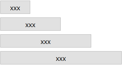 |
By setting the second element, you can also control the height:
| In[38]:= | ![ResourceFunction["DynamicEnabledButton"]["xxx", Null, ImageSize -> {Automatic, 50}]](https://www.wolframcloud.com/obj/resourcesystem/images/7fe/7fec88f6-da14-4ff4-8f40-a2480f8eb405/152df84d40ac41b1.png) |
| Out[38]= | 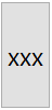 |
A fully customized image size:
| In[39]:= | ![ResourceFunction["DynamicEnabledButton"]["xxx", Null, ImageSize -> {100, 50}]](https://www.wolframcloud.com/obj/resourcesystem/images/7fe/7fec88f6-da14-4ff4-8f40-a2480f8eb405/321c9bceb2e3aae3.png) |
| Out[39]= | 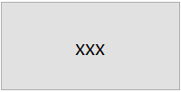 |
Make a button that automatically indicates when it is busy computing something:
| In[40]:= | ![ResourceFunction["DynamicEnabledButton"][
Dynamic[running],
PaneSelector[{True -> "Run", False -> ProgressIndicator[Appearance -> "Percolate"]}, Dynamic[running]],
Print[Table[Length[FactorInteger[2^n - 1]], {n, 50, 500, 50}]]
]](https://www.wolframcloud.com/obj/resourcesystem/images/7fe/7fec88f6-da14-4ff4-8f40-a2480f8eb405/73e43846709b2685.png) |
| Out[40]= |  |
Create a button that deletes itself after spending a few seconds to express how it feels about being deleted:
| In[41]:= | ![ResourceFunction["DynamicEnabledButton"][
Dynamic[del],
PaneSelector[{True -> "Delete", False -> Style["\[SadSmiley]", Large]}, Dynamic[del]],
Pause[5];
NotebookDelete[EvaluationCell[]]
]](https://www.wolframcloud.com/obj/resourcesystem/images/7fe/7fec88f6-da14-4ff4-8f40-a2480f8eb405/089ac3c0e570bf06.png) |
Similar behavior to DynamicEnabledButton[Dynamic[x],label,action] can be achieved with Button:
| In[42]:= | ![ResourceFunction["DynamicEnabledButton"][Dynamic[aa], "test", Pause[5]]](https://www.wolframcloud.com/obj/resourcesystem/images/7fe/7fec88f6-da14-4ff4-8f40-a2480f8eb405/7495932ccb96dfef.png) |
| Out[42]= |  |
| In[43]:= | ![bb = True;
Button["test", bb = False; Pause[5]; bb = True, Enabled -> Dynamic[bb], Method -> "Queued"]](https://www.wolframcloud.com/obj/resourcesystem/images/7fe/7fec88f6-da14-4ff4-8f40-a2480f8eb405/2b1413805784e89c.png) |
| Out[32]= |  |
The enabled state of the button is restored even if an abort occurs:
| In[44]:= | ![ResourceFunction["DynamicEnabledButton"][Dynamic[cc], "test", Pause[1]; Abort[]; Pause[10]]](https://www.wolframcloud.com/obj/resourcesystem/images/7fe/7fec88f6-da14-4ff4-8f40-a2480f8eb405/3bfb95156abc1bce.png) |
| Out[44]= |  |
This prevents the button from ending up in a “bad” state:
| In[45]:= | ![dd = True;
Button["test", dd = False; Pause[1]; Abort[]; Pause[10]; dd = True, Enabled -> Dynamic[dd], Method -> "Queued"]](https://www.wolframcloud.com/obj/resourcesystem/images/7fe/7fec88f6-da14-4ff4-8f40-a2480f8eb405/7a74e49a582a788f.png) |
| Out[32]= |  |
The appearance of the button will not update when using Method→"Preemptive":
| In[46]:= | ![ResourceFunction["DynamicEnabledButton"]["test", Pause[5], Method -> "Preemptive"]](https://www.wolframcloud.com/obj/resourcesystem/images/7fe/7fec88f6-da14-4ff4-8f40-a2480f8eb405/0849deff332890a8.png) |
| Out[46]= |  |
In DynamicEnabledButton[Dynamic[x],label,action], the symbol x must not be a DynamicModule symbol in order for the enabled state to update:
| In[47]:= | ![DynamicModule[{x}, ResourceFunction["DynamicEnabledButton"][Dynamic[x], "test", Pause[5]]]](https://www.wolframcloud.com/obj/resourcesystem/images/7fe/7fec88f6-da14-4ff4-8f40-a2480f8eb405/3eade6bd87614d04.png) |
| Out[47]= |  |
This is also true for Button:
| In[48]:= | ![DynamicModule[{x = True},
Button["test", x = False; Pause[5]; x = True, Enabled -> Dynamic[x], Method -> "Queued"]
]](https://www.wolframcloud.com/obj/resourcesystem/images/7fe/7fec88f6-da14-4ff4-8f40-a2480f8eb405/277ab25c417e5e49.png) |
| Out[48]= |  |
The dynamic binding must have just one argument and no options:
| In[49]:= | ![ResourceFunction["DynamicEnabledButton"][
Dynamic[symbol, SingleEvaluation -> True], "label", Pause[5]]](https://www.wolframcloud.com/obj/resourcesystem/images/7fe/7fec88f6-da14-4ff4-8f40-a2480f8eb405/65118fb8c8b796f7.png) |
| Out[49]= |  |
If the binding is unable to be set, no errors will be triggered when the button is created:
| In[50]:= | ![protected = True;
Protect[protected]](https://www.wolframcloud.com/obj/resourcesystem/images/7fe/7fec88f6-da14-4ff4-8f40-a2480f8eb405/7d42a21e1421a32b.png) |
| Out[48]= |  |
| In[51]:= | ![ResourceFunction["DynamicEnabledButton"][Dynamic[protected], "label", Print["running"]; Pause[5]; Print["done"]]](https://www.wolframcloud.com/obj/resourcesystem/images/7fe/7fec88f6-da14-4ff4-8f40-a2480f8eb405/55164edf4d2fb98b.png) |
| Out[51]= |  |
Messages will appear when the button code executes and the state of the button will fail to update:
| In[52]:= | ![ResourceFunction["DynamicEnabledButton"][Dynamic[protected], "label", Print["running"]; Pause[5]; Print["done"]]](https://www.wolframcloud.com/obj/resourcesystem/images/7fe/7fec88f6-da14-4ff4-8f40-a2480f8eb405/6f914c7e452a654c.png) |
| Out[52]= |  |
Watch Birdnardo do a flip:
| In[53]:= | ![ResourceFunction["DynamicEnabledButton"][
Dynamic[bs],
PaneSelector[{
True -> ResourceFunction["BirdSay"]["Click to watch me do a flip"],
False -> ResourceFunction["BirdSay"]["Oh no! I'm stuck!", {Top, Right}]
},
Dynamic[bs]
],
Pause[5]
]](https://www.wolframcloud.com/obj/resourcesystem/images/7fe/7fec88f6-da14-4ff4-8f40-a2480f8eb405/1f5e82916d16be04.png) |
| Out[53]= | 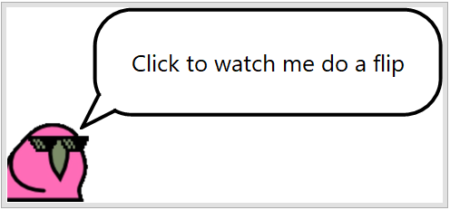 |
This work is licensed under a Creative Commons Attribution 4.0 International License
![Table[ResourceFunction["DynamicEnabledButton"]["xxx", Null, FrameMargins -> m], {m, {0, 5, 10, 20}}]](https://www.wolframcloud.com/obj/resourcesystem/images/7fe/7fec88f6-da14-4ff4-8f40-a2480f8eb405/3a4d2d2995912ba6.png)
![Table[Framed@
ResourceFunction["DynamicEnabledButton"]["xxx", Null, ImageMargins -> m], {m, {0, 5, 10, 20}}]](https://www.wolframcloud.com/obj/resourcesystem/images/7fe/7fec88f6-da14-4ff4-8f40-a2480f8eb405/2d419a1cb88cefaf.png)