Wolfram Function Repository
Instant-use add-on functions for the Wolfram Language
Function Repository Resource:
Visualize numeric data using tessellated rectangles with proportionate area
ResourceFunction["RectangleAreaChart"][{d1,d2,…}] generates a graphic of tessellated rectangles each sized in proportion di. | |
ResourceFunction["RectangleAreaChart"][{lab1→d1,lab2→d2,…}] generates a graphic of tessellated rectangles each sized in proportion di labeled with labi. | |
ResourceFunction["RectangleAreaChart"][assoc] generates a graphic of tessellated rectangles labeled with the keys of Association assoc. |
| BoundaryStyle | Black | style used for edges of the individual rectangles |
| "ChartColors" | White | the colors of individual rectangles |
| "LabelColors" | Automatic | the colors of individual labels |
| "Sorting" | True | whether to sort the data to place the largest values first |
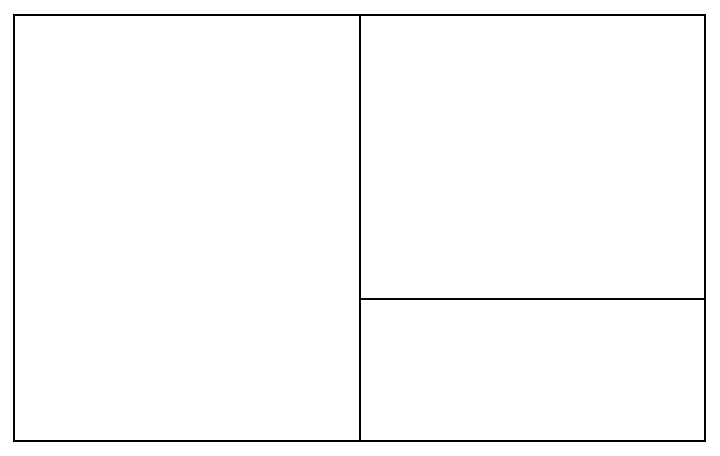
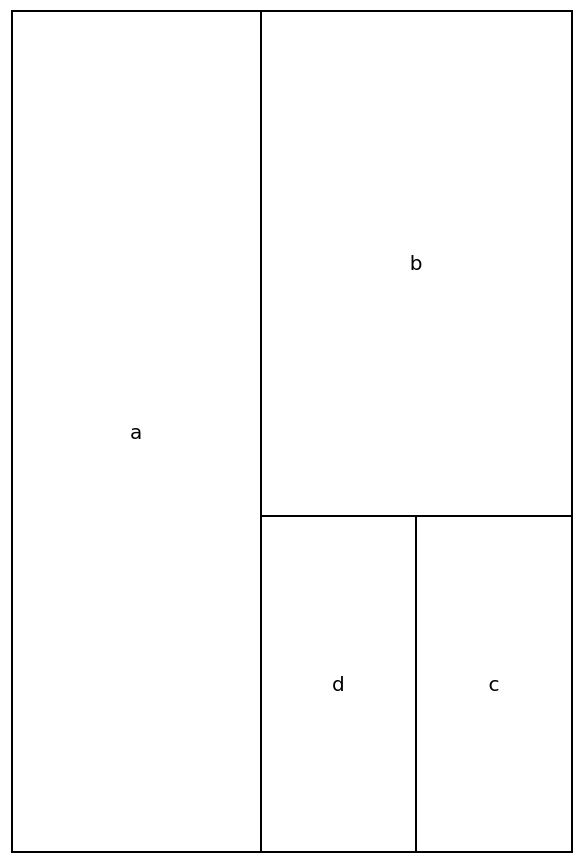
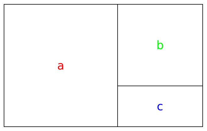
Create a chart of three rectangles with relative areas of 3, 2 and 1:
| In[1]:= |
|
| Out[1]= |
|
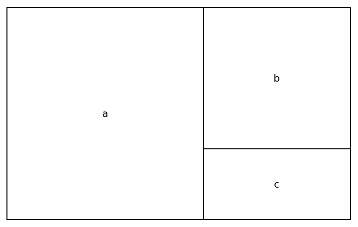
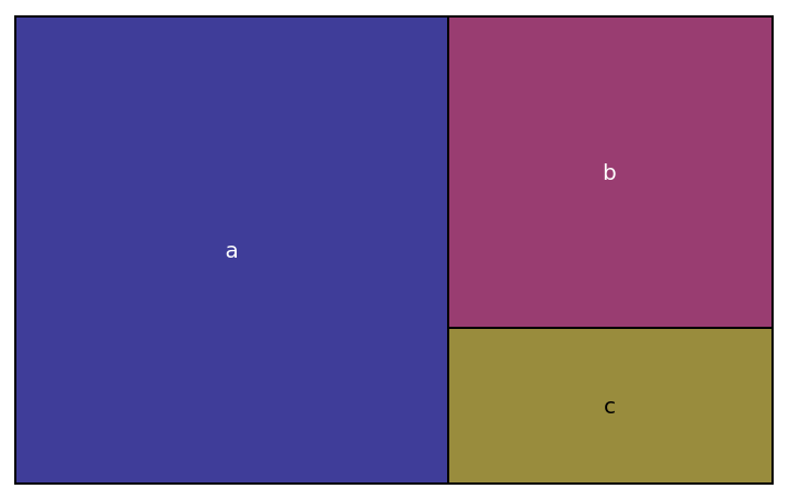
Create a chart of three labeled rectangles with relative areas of 3, 2 and 1:
| In[2]:= |
|
| Out[2]= |
|
Use an association:
| In[3]:= |
|
| Out[3]= |
|
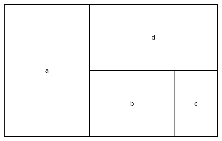
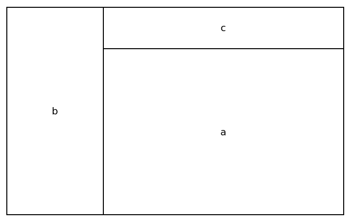
The layout in RectangleAreaChart is influenced by AspectRatio:
| In[4]:= |
|
| Out[4]= |
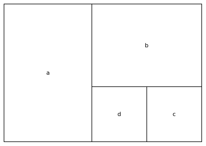
|
| In[5]:= |
|
| Out[5]= |
|
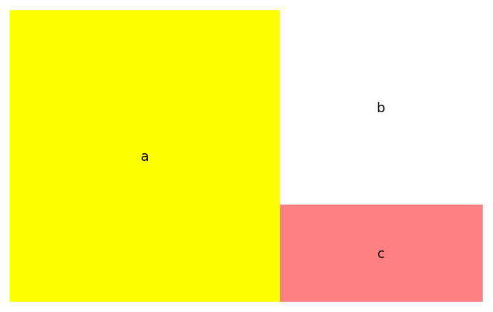
The edges of the rectangles can be styled with BoundaryStyle:
| In[6]:= |
|
| Out[6]= |
|
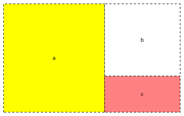
Use BoundaryStyle→None to hide the boundaries:
| In[7]:= |
|
| Out[7]= |
|
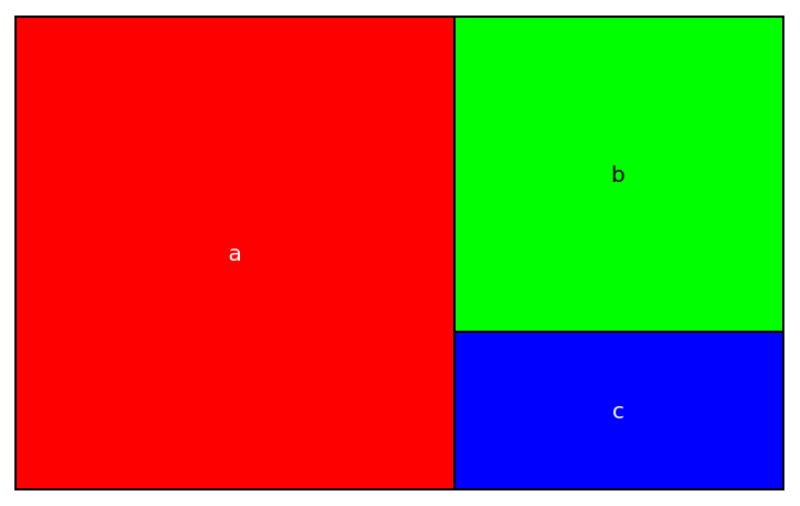
The individual elements can be colored with "ChartColors" using a list of colors. Labels default to black or white depending on the rectangle background color:
| In[8]:= |
|
| Out[8]= |
|
Use a ColorDataFunction capable of taking index values:
| In[9]:= |
|
| Out[9]= |
|
Individual labels can be colored with "LabelColors":
| In[10]:= |
|
| Out[10]= |
|
The chart is filled from the top left corner towards the bottom right. For the most even appearance, data is sorted first, but with "Sorting"→False, data will be used in the order given:
| In[11]:= |
|
| Out[11]= |
|
Visualize the relative populations of South American countries:
| In[12]:= |
![ResourceFunction["RectangleAreaChart"][
If[#["Population"] < Quantity[1000000, "People"], None, #["Name"]] -> #["Population"] & /@ EntityList[EntityClass["Country", "SouthAmerica"]], "ChartColors" -> ColorData[10]]](https://www.wolframcloud.com/obj/resourcesystem/images/af4/af4f1e1d-42d5-47ce-81ad-685928e5dd64/149e6418bf805358.png)
|
| Out[12]= |
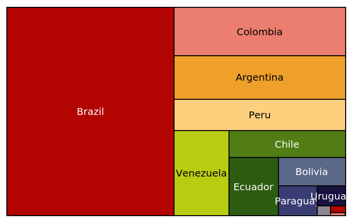
|
This work is licensed under a Creative Commons Attribution 4.0 International License