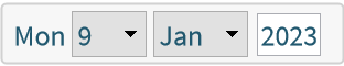
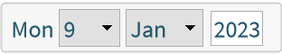
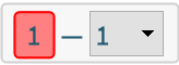
Basic Examples (3)
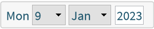
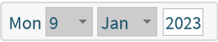
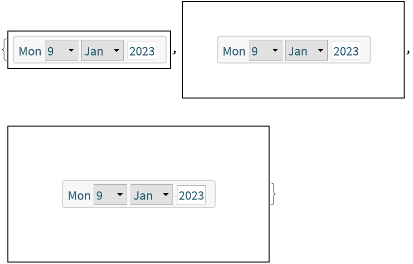
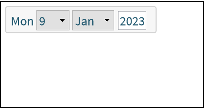
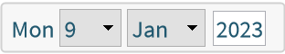
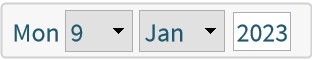
Display a date setter control:
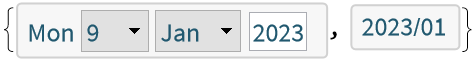
Dynamically update the value of x:
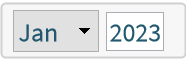
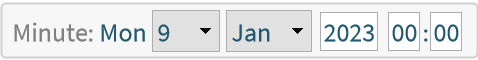
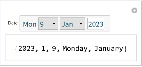
Display a DateObject to a specific granularity:
Scope (4)
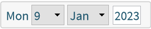
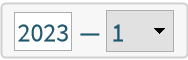
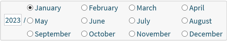
Initialize the interface using a supported date specification:
Use DateSetter as a control within Manipulate:
Make an interface for controlling AbsoluteTime:
Make an interface for controlling a DateString expression:
Options (28)
Appearance (10)
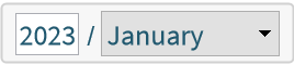
Set the appearance to match a DateString specification:
Use a list of DateString specifications. Valid granularities automatically become controls while other strings display as written:
Use Rule to suggest the control type. None suppresses the control:
Use a control like SetterBar or PopupMenu instead of the default:
The DateString specification "MonthName" and its short variants are special cases. They provide a labeled control to set the month value:
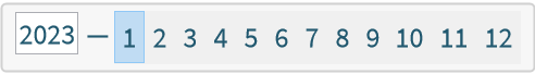
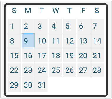
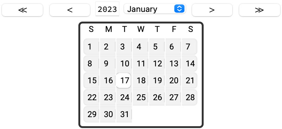
Use "Calendar" to create a day calendar control:
Use PopupMenu to hide the day calendar until you click the control:
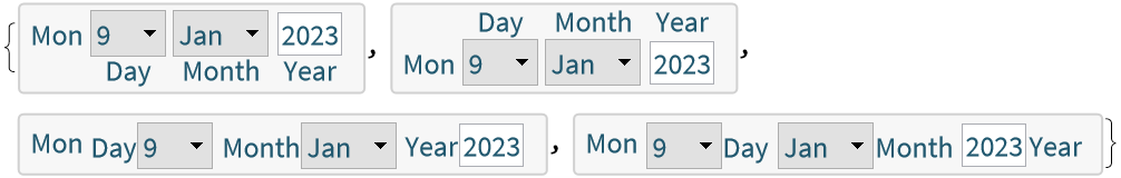
Use a pure function to specify the appearance of an individual control. The first Slot is automatically filled with the appropriate Dynamic expression:
For date elements that have a finite number of values, like the months, use a second Slot to indicate labeled date elements:
Use a pure function for the Appearance option to set the overall appearance. Named slots with date elements are replaced with the corresponding granularity control:
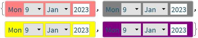
Background (2)
Change the background color:
Background is ignored if the Appearance is a pure function:
BaseStyle (2)
Use a named style:
Affect the specific control types using their box options:
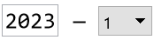
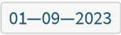
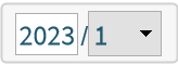
DateFormat (4)
DateFormat only affects the underlying DateObject expression:
If specifying individual DateString elements then the delimiter is automatically chosen:
Use an Association to specify both the elements and delimiters. The "Elements" key is used to list the DateString elements and specify the delimiter with the "Delimiters" key:
Use Appearance to alter the automatic appearance of the interface without affecting the underlying DateObject:
Enabled (2)
By default, DateSetter is enabled:
Be setting Enabled → False, the interface is disabled but visible in its current state:
ImageMargins (1)
Add margins outside the date setter:
ImageSize (2)
Set the width of the date setter:
The display clips if ImageSize is too small:
LabelingFunction (3)
The individual granularity controls are automatically labeled using Tooltip. Hover over the individual controls to see the calendar granularity that they affect:
Use LabelingFunction→None to suppress all labels:
Use directions Left, Right, Above and Below to insert granularity control labels within the interface:
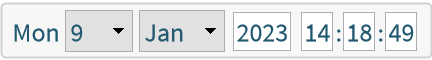
TimeZone (1)
Use TimeZone to set the time zone specification of the underlying DateObject:
Possible Issues (6)
DateSetter only accepts allowed granularities for the CalendarType option:
Use CalendarData to find available granularities for the given calendar:
Appearance components are case-sensitive. Any misspelled components pass through as written:
Correct any spelling mistakes to fix the display:
Improperly specified Appearance components display as a warning:
Correct any mistakes in the indicated component:
![ResourceFunction["DateSetter"][]](https://www.wolframcloud.com/obj/resourcesystem/images/ad4/ad4308ac-24f7-4286-a649-8acaa81e811e/1981289795be5a7b.png)
![{ResourceFunction["DateSetter"][Dynamic[x]], Dynamic[x]}](https://www.wolframcloud.com/obj/resourcesystem/images/ad4/ad4308ac-24f7-4286-a649-8acaa81e811e/058e41c0502f7d9f.png)
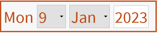
![ResourceFunction["DateSetter"][Today, "Month"]](https://www.wolframcloud.com/obj/resourcesystem/images/ad4/ad4308ac-24f7-4286-a649-8acaa81e811e/2790832403fb67b4.png)
![ResourceFunction["DateSetter"][Today, "Minute"]](https://www.wolframcloud.com/obj/resourcesystem/images/ad4/ad4308ac-24f7-4286-a649-8acaa81e811e/204a810fa881bcad.png)
![ResourceFunction["DateSetter"]["2020 1 1 8am"]](https://www.wolframcloud.com/obj/resourcesystem/images/ad4/ad4308ac-24f7-4286-a649-8acaa81e811e/751843d78dcfe379.png)
![ResourceFunction["DateSetter"][{2020, 1, 1, 8}]](https://www.wolframcloud.com/obj/resourcesystem/images/ad4/ad4308ac-24f7-4286-a649-8acaa81e811e/0c689ba75b2482af.png)
![ResourceFunction["DateSetter"][3786854400, "Hour"]](https://www.wolframcloud.com/obj/resourcesystem/images/ad4/ad4308ac-24f7-4286-a649-8acaa81e811e/40f6ff001e0f5e77.png)
![Manipulate[
DateValue[x, {"Year", "Month", "Day", "DayName", "MonthName"}],
{{x, Today, "Date"}, ResourceFunction["DateSetter"][##] &}]](https://www.wolframcloud.com/obj/resourcesystem/images/ad4/ad4308ac-24f7-4286-a649-8acaa81e811e/0ddf2b34c02980e0.png)
![x2 = AbsoluteTime[Today];
ResourceFunction["DateSetter"][
Dynamic[DateObject[x2], (x2 = AbsoluteTime[#]) &]]](https://www.wolframcloud.com/obj/resourcesystem/images/ad4/ad4308ac-24f7-4286-a649-8acaa81e811e/4eefc6d38702cc00.png)
![Dynamic[x2]](https://www.wolframcloud.com/obj/resourcesystem/images/ad4/ad4308ac-24f7-4286-a649-8acaa81e811e/1b743182e660d3a6.png)
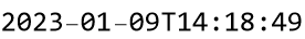
![x3 = DateString[Now, "ISODateTime"];
ResourceFunction["DateSetter"][
Dynamic[DateObject[
x3], (x3 = DateString[#, "ISODateTime"]) &], "Instant"]](https://www.wolframcloud.com/obj/resourcesystem/images/ad4/ad4308ac-24f7-4286-a649-8acaa81e811e/48b77ed8ac16cc40.png)
![Dynamic[x3]](https://www.wolframcloud.com/obj/resourcesystem/images/ad4/ad4308ac-24f7-4286-a649-8acaa81e811e/505815867b4bef3f.png)
![ResourceFunction["DateSetter"][Now, Appearance -> "DateTime"]](https://www.wolframcloud.com/obj/resourcesystem/images/ad4/ad4308ac-24f7-4286-a649-8acaa81e811e/2a1a5799f56cd53e.png)
![ResourceFunction["DateSetter"][
Appearance -> {"Year", " \[LongDash] ", "Month"}]](https://www.wolframcloud.com/obj/resourcesystem/images/ad4/ad4308ac-24f7-4286-a649-8acaa81e811e/364cd649d510b3c4.png)
![ResourceFunction["DateSetter"][
Appearance -> {"Year" -> None, " \[LongDash] ", "Month"}]](https://www.wolframcloud.com/obj/resourcesystem/images/ad4/ad4308ac-24f7-4286-a649-8acaa81e811e/1c7fc8ad83d046b1.png)
![ResourceFunction["DateSetter"][
Appearance -> {"Year", " \[LongDash] ", "Month" -> SetterBar}]](https://www.wolframcloud.com/obj/resourcesystem/images/ad4/ad4308ac-24f7-4286-a649-8acaa81e811e/682f43f15a600fe5.png)
![ResourceFunction["DateSetter"][
Appearance -> {"Year", " / ", "MonthName" -> PopupMenu}]](https://www.wolframcloud.com/obj/resourcesystem/images/ad4/ad4308ac-24f7-4286-a649-8acaa81e811e/429feb4d96cddcb6.png)
![ResourceFunction["DateSetter"][
Appearance -> {"Year", " / ", "MonthNameShort" -> SetterBar}]](https://www.wolframcloud.com/obj/resourcesystem/images/ad4/ad4308ac-24f7-4286-a649-8acaa81e811e/0d29b3ccef54aa82.png)
![ResourceFunction["DateSetter"][Appearance -> "Calendar"]](https://www.wolframcloud.com/obj/resourcesystem/images/ad4/ad4308ac-24f7-4286-a649-8acaa81e811e/6c94ce18e277c4fd.png)
![ResourceFunction["DateSetter"][
Appearance -> {"Calendar" -> PopupMenu}]](https://www.wolframcloud.com/obj/resourcesystem/images/ad4/ad4308ac-24f7-4286-a649-8acaa81e811e/6b978cbfb4962339.png)
![restrictedYears = PopupMenu[#1, Range[1990, 2000], FrameMargins -> Automatic] &;
ResourceFunction["DateSetter"][
Appearance -> {"Year" -> restrictedYears, " / ", "Month"}]](https://www.wolframcloud.com/obj/resourcesystem/images/ad4/ad4308ac-24f7-4286-a649-8acaa81e811e/533920ea2a87d643.png)
![radioButtonMonthSelector = RadioButtonBar[#1, #2, Method -> "Active", Appearance -> "Horizontal" -> {Automatic, 4}] &;
ResourceFunction["DateSetter"][
Appearance -> {"Year", " / ", "MonthName" -> radioButtonMonthSelector}]](https://www.wolframcloud.com/obj/resourcesystem/images/ad4/ad4308ac-24f7-4286-a649-8acaa81e811e/065a80ea8e15d377.png)
![appearance = Grid[{{#Year}, {#Month -> PopupMenu}}, Alignment -> Left] &;
ResourceFunction["DateSetter"][Appearance -> appearance]](https://www.wolframcloud.com/obj/resourcesystem/images/ad4/ad4308ac-24f7-4286-a649-8acaa81e811e/79d5348cc62f1e66.png)
![Table[ResourceFunction["DateSetter"][
Background -> b], {b, {Pink, Gray, Yellow, Purple}}]](https://www.wolframcloud.com/obj/resourcesystem/images/ad4/ad4308ac-24f7-4286-a649-8acaa81e811e/39470a6205a15f60.png)
![ResourceFunction["DateSetter"][Background -> Red, Appearance -> (Row[{#Year, " \[LongDash] ", #Month}] &)]](https://www.wolframcloud.com/obj/resourcesystem/images/ad4/ad4308ac-24f7-4286-a649-8acaa81e811e/133db2431afbc72b.png)
![ResourceFunction["DateSetter"][BaseStyle -> "Section"]](https://www.wolframcloud.com/obj/resourcesystem/images/ad4/ad4308ac-24f7-4286-a649-8acaa81e811e/5a109bc7fbd83d2a.png)
![bs = {
FontFamily -> "Times", FontColor -> Red, FontSize -> 20,
FrameBoxOptions -> {FrameStyle -> Black},
InputFieldBoxOptions -> {Background -> LightBlue, Appearance -> "Frameless"},
PopupMenuBoxOptions -> {Appearance -> "Button"}};
ResourceFunction["DateSetter"][BaseStyle -> bs]](https://www.wolframcloud.com/obj/resourcesystem/images/ad4/ad4308ac-24f7-4286-a649-8acaa81e811e/246ad77d1cb7a3ea.png)
![x5 = Today;
ResourceFunction["DateSetter"][Dynamic[x5], DateFormat -> {"Year", "/", "Month"}]](https://www.wolframcloud.com/obj/resourcesystem/images/ad4/ad4308ac-24f7-4286-a649-8acaa81e811e/6c8d051d31e00a62.png)
![Dynamic[x5]](https://www.wolframcloud.com/obj/resourcesystem/images/ad4/ad4308ac-24f7-4286-a649-8acaa81e811e/570d875f3dc1f517.png)
![x6 = Today;
ResourceFunction["DateSetter"][Dynamic[x6], DateFormat -> {"Month", "Day", "Year"}]](https://www.wolframcloud.com/obj/resourcesystem/images/ad4/ad4308ac-24f7-4286-a649-8acaa81e811e/62655b9fbd3b310c.png)
![Dynamic[x6]](https://www.wolframcloud.com/obj/resourcesystem/images/ad4/ad4308ac-24f7-4286-a649-8acaa81e811e/0ccbdefca9f235a6.png)
![x7 = Today;
ResourceFunction["DateSetter"][Dynamic[x7], DateFormat -> <|"Delimiters" -> "\[LongDash]", "Elements" -> {"Month", "Day", "Year"}|>]](https://www.wolframcloud.com/obj/resourcesystem/images/ad4/ad4308ac-24f7-4286-a649-8acaa81e811e/7a9416a91838bb21.png)
![Dynamic[x7]](https://www.wolframcloud.com/obj/resourcesystem/images/ad4/ad4308ac-24f7-4286-a649-8acaa81e811e/61856f2c6c1eeef6.png)
![x8 = Today;
ResourceFunction["DateSetter"][Dynamic[x8], Appearance -> {"Year", "/", "Month"}]](https://www.wolframcloud.com/obj/resourcesystem/images/ad4/ad4308ac-24f7-4286-a649-8acaa81e811e/43b4c6e52940d2fe.png)
![Dynamic[x8]](https://www.wolframcloud.com/obj/resourcesystem/images/ad4/ad4308ac-24f7-4286-a649-8acaa81e811e/27b87cd8e967a081.png)
![ResourceFunction["DateSetter"][]](https://www.wolframcloud.com/obj/resourcesystem/images/ad4/ad4308ac-24f7-4286-a649-8acaa81e811e/54361249a1568071.png)
![ResourceFunction["DateSetter"][Enabled -> False]](https://www.wolframcloud.com/obj/resourcesystem/images/ad4/ad4308ac-24f7-4286-a649-8acaa81e811e/1ae9b99625be957e.png)
![Table[Framed@
ResourceFunction["DateSetter"][ImageMargins -> m], {m, {0, 30, 50}}]](https://www.wolframcloud.com/obj/resourcesystem/images/ad4/ad4308ac-24f7-4286-a649-8acaa81e811e/0924581c5e0c9d64.png)
![Framed[ResourceFunction["DateSetter"][ImageSize -> {200, 100}]]](https://www.wolframcloud.com/obj/resourcesystem/images/ad4/ad4308ac-24f7-4286-a649-8acaa81e811e/0f9593e63b89c4a8.png)
![ResourceFunction["DateSetter"][ImageSize -> 50]](https://www.wolframcloud.com/obj/resourcesystem/images/ad4/ad4308ac-24f7-4286-a649-8acaa81e811e/7360eac0eb396125.png)
![ResourceFunction["DateSetter"][]](https://www.wolframcloud.com/obj/resourcesystem/images/ad4/ad4308ac-24f7-4286-a649-8acaa81e811e/109e376398709dc3.png)
![ResourceFunction["DateSetter"][LabelingFunction -> None]](https://www.wolframcloud.com/obj/resourcesystem/images/ad4/ad4308ac-24f7-4286-a649-8acaa81e811e/3f958a07f48c314c.png)
![Table[ResourceFunction["DateSetter"][
LabelingFunction -> lab], {lab, {Below, Above, Left, Right}}]](https://www.wolframcloud.com/obj/resourcesystem/images/ad4/ad4308ac-24f7-4286-a649-8acaa81e811e/5beaa0b416b985ea.png)
![x9 = Today;
ResourceFunction["DateSetter"][Dynamic[x9], "Hour", TimeZone -> "Pacific/Guadalcanal"]](https://www.wolframcloud.com/obj/resourcesystem/images/ad4/ad4308ac-24f7-4286-a649-8acaa81e811e/7c19955c43e84568.png)
![Dynamic[x9]](https://www.wolframcloud.com/obj/resourcesystem/images/ad4/ad4308ac-24f7-4286-a649-8acaa81e811e/281332d957d2c2c5.png)
![fullCalendarAppearance = Column[{Grid[{{
Button["\[LeftSkeleton]", x10 = DatePlus[x10, Quantity[-1, "Years"]]],
Button["<", x10 = DatePlus[x10, Quantity[-1, "Months"]]], #Year, #MonthName -> PopupMenu, Button[">", x10 = DatePlus[x10, Quantity[1, "Months"]]], Button["\[RightSkeleton]", x10 = DatePlus[x10, Quantity[1, "Years"]]]}}], #Calendar}, Alignment -> Center] &;](https://www.wolframcloud.com/obj/resourcesystem/images/ad4/ad4308ac-24f7-4286-a649-8acaa81e811e/27672d314959b4a0.png)
![x10 = Today;
ResourceFunction["DateSetter"][Dynamic[x10], Appearance -> fullCalendarAppearance, LabelingFunction -> None]](https://www.wolframcloud.com/obj/resourcesystem/images/ad4/ad4308ac-24f7-4286-a649-8acaa81e811e/6f6e97d0a47aa330.png)
![x11 = DateObject[{2021, 12, 31}];
ResourceFunction["DateSetter"][Dynamic[x11]]](https://www.wolframcloud.com/obj/resourcesystem/images/ad4/ad4308ac-24f7-4286-a649-8acaa81e811e/5a1c832b3d57b08f.png)
![Button["Advance month", x11 = DatePlus[x11, Quantity[1, "Months"]]]](https://www.wolframcloud.com/obj/resourcesystem/images/ad4/ad4308ac-24f7-4286-a649-8acaa81e811e/5b153e53b82088c2.png)
![ResourceFunction["DateSetter"][Today, "Unknown"]](https://www.wolframcloud.com/obj/resourcesystem/images/ad4/ad4308ac-24f7-4286-a649-8acaa81e811e/00676542677136b4.png)
![CalendarData["Gregorian", "Granularities"]](https://www.wolframcloud.com/obj/resourcesystem/images/ad4/ad4308ac-24f7-4286-a649-8acaa81e811e/589eb088054a26f5.png)
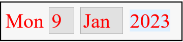
![ResourceFunction["DateSetter"][Today, Appearance -> {"year", " \[LongDash] ", "Mnth"}]](https://www.wolframcloud.com/obj/resourcesystem/images/ad4/ad4308ac-24f7-4286-a649-8acaa81e811e/22483707d223120f.png)
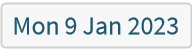
![ResourceFunction["DateSetter"][Today, Appearance -> {"Year", " \[LongDash] ", "Month"}]](https://www.wolframcloud.com/obj/resourcesystem/images/ad4/ad4308ac-24f7-4286-a649-8acaa81e811e/04939131c1b021e7.png)
![ResourceFunction["DateSetter"][Today, Appearance -> {1, " \[LongDash] ", "Month"}]](https://www.wolframcloud.com/obj/resourcesystem/images/ad4/ad4308ac-24f7-4286-a649-8acaa81e811e/5b3b095d0d10be46.png)
![ResourceFunction["DateSetter"][Today, Appearance -> {"1", " \[LongDash] ", "Month"}]](https://www.wolframcloud.com/obj/resourcesystem/images/ad4/ad4308ac-24f7-4286-a649-8acaa81e811e/221edd89a04538d3.png)
![x4 = CalendarConvert[Today, "ArithmeticFrench"];
ResourceFunction["DateSetter"][Dynamic[x4], CalendarType -> "ArithmeticFrench"]](https://www.wolframcloud.com/obj/resourcesystem/images/ad4/ad4308ac-24f7-4286-a649-8acaa81e811e/23e66a9dca59abb7.png)