Wolfram Function Repository
Instant-use add-on functions for the Wolfram Language
Function Repository Resource:
Create a style-customizable checkbox bar
ResourceFunction["StyledCheckboxBar"][x,{val1,val2 ,val3…}] represents a styled checkbox bar with setting x and with checkboxes for values vali to include in the List x. | |
A StyledCheckboxBar with default states:
| In[1]:= | ![ResourceFunction["StyledCheckboxBar"][Dynamic[x1], {1, 2, 3, 4, 5}]](https://www.wolframcloud.com/obj/resourcesystem/images/a6b/a6bc2474-dc90-490c-bdb2-cd17a8c1f852/058885b51038e195.png) |
| Out[1]= |  |
The second argument can be a List of rules of the form value → label:
| In[2]:= | ![{ResourceFunction["StyledCheckboxBar"][
Dynamic[x2], {1 -> "One", 2 -> "Two", 3 -> "Three"}], Dynamic[x2]}](https://www.wolframcloud.com/obj/resourcesystem/images/a6b/a6bc2474-dc90-490c-bdb2-cd17a8c1f852/1b2c0e9153b25200.png) |
| Out[2]= |  |
Any Wolfram Language expression can be used as the label:
| In[3]:= | ![a = Plot[Sin[x], {x, 0, 2 \[Pi]}, ImageSize -> 40, Axes -> False];
b = (-1 + Sqrt[5])/2;
c = ImageResize[ExampleData[{"TestImage", "Girl"}], 40];](https://www.wolframcloud.com/obj/resourcesystem/images/a6b/a6bc2474-dc90-490c-bdb2-cd17a8c1f852/213d90453d23bc66.png) |
| In[4]:= | ![ResourceFunction["StyledCheckboxBar"][
Dynamic[exp], {1 -> a, 2 -> b, 3 -> c}]](https://www.wolframcloud.com/obj/resourcesystem/images/a6b/a6bc2474-dc90-490c-bdb2-cd17a8c1f852/33c63bcaee9fc462.png) |
| Out[4]= |  |
Appearance can be used to change the colors of the different states. Use the sub-option "InactiveColor" to change color when the state is False:
| In[5]:= | ![ResourceFunction["StyledCheckboxBar"][Dynamic[x3], Range[5], Appearance -> {"InactiveColor" -> LightRed}]](https://www.wolframcloud.com/obj/resourcesystem/images/a6b/a6bc2474-dc90-490c-bdb2-cd17a8c1f852/128ae802314762d9.png) |
| Out[5]= | 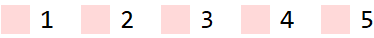 |
The sub-option "ActiveColor" modifies the color when the state is True:
| In[6]:= | ![ResourceFunction["StyledCheckboxBar"][Dynamic[x4], Range[5], Appearance -> {"InactiveColor" -> LightRed, "ActiveColor" -> Darker[Green]}]](https://www.wolframcloud.com/obj/resourcesystem/images/a6b/a6bc2474-dc90-490c-bdb2-cd17a8c1f852/11fdc5e392cba7b0.png) |
| Out[6]= |  |
"Hover" modifies the color when the mouse is hovered over the checkbox when it is in the False state:
| In[7]:= | ![ResourceFunction["StyledCheckboxBar"][Dynamic[x5], Range[5], Appearance -> {"InactiveColor" -> LightRed, "ActiveColor" -> Darker[Green], "Hover" -> LightBlue}]](https://www.wolframcloud.com/obj/resourcesystem/images/a6b/a6bc2474-dc90-490c-bdb2-cd17a8c1f852/35a5c6dc1cea55e0.png) |
| Out[7]= |  |
"CheckColor" modifies the color of the check mark when in the True state:
| In[8]:= | ![ResourceFunction["StyledCheckboxBar"][Dynamic[x6], Range[5], Appearance -> {"InactiveColor" -> LightRed, "ActiveColor" -> Darker[Green], "Hover" -> LightBlue, "CheckColor" -> Black}]](https://www.wolframcloud.com/obj/resourcesystem/images/a6b/a6bc2474-dc90-490c-bdb2-cd17a8c1f852/2925b0c07cdfc459.png) |
| Out[8]= | 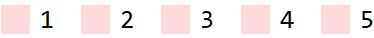 |
"Alignment" can be used to arrange the layout either horizontally or vertically:
| In[9]:= | ![ResourceFunction["StyledCheckboxBar"][Dynamic[x7], Range[5], Appearance -> {"Alignment" -> "Vertical"}]](https://www.wolframcloud.com/obj/resourcesystem/images/a6b/a6bc2474-dc90-490c-bdb2-cd17a8c1f852/5c8a27a0ee303023.png) |
| Out[9]= | 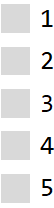 |
Specify the number of rows or columns as second item in the list:
| In[10]:= | ![ResourceFunction["StyledCheckboxBar"][Dynamic[x8], Range[5], Appearance -> {"Alignment" -> {"Vertical", 2}}]](https://www.wolframcloud.com/obj/resourcesystem/images/a6b/a6bc2474-dc90-490c-bdb2-cd17a8c1f852/341343e8e8390438.png) |
| Out[10]= | 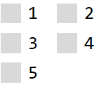 |
Setting Enabled to False prevents the checkbox bar from being controllable:
| In[11]:= | ![ResourceFunction["StyledCheckboxBar"][Dynamic[x9], {1, 2, 3}, Enabled -> False]](https://www.wolframcloud.com/obj/resourcesystem/images/a6b/a6bc2474-dc90-490c-bdb2-cd17a8c1f852/3efe13f71e550b3c.png) |
| Out[11]= |  |
Adjust the spacings between individual checkboxes:
| In[12]:= | ![Column[Table[
ResourceFunction["StyledCheckboxBar"][Dynamic[x10], {1, 2, 3}, Spacings -> space], {space, 3}]]](https://www.wolframcloud.com/obj/resourcesystem/images/a6b/a6bc2474-dc90-490c-bdb2-cd17a8c1f852/79c5ff942199659c.png) |
| Out[12]= | 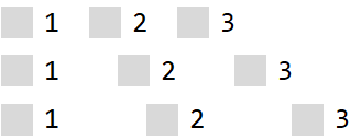 |
Increase the size of the checkboxes:
| In[13]:= | ![ResourceFunction["StyledCheckboxBar"][Dynamic[x11], Range[5], Magnification -> 1.5]](https://www.wolframcloud.com/obj/resourcesystem/images/a6b/a6bc2474-dc90-490c-bdb2-cd17a8c1f852/7883409bb9703b0c.png) |
| Out[13]= |  |
StyledCheckboxBar and CheckboxBar are similar in functionality:
| In[14]:= | ![ResourceFunction["StyledCheckboxBar"][Dynamic[t1], Range[5]]](https://www.wolframcloud.com/obj/resourcesystem/images/a6b/a6bc2474-dc90-490c-bdb2-cd17a8c1f852/1c2d142559c41404.png) |
| Out[14]= |  |
| In[15]:= | ![CheckboxBar[Dynamic[t2], Range[5]]](https://www.wolframcloud.com/obj/resourcesystem/images/a6b/a6bc2474-dc90-490c-bdb2-cd17a8c1f852/2b3e7c4561a34371.png) |
| Out[15]= |  |
However, various stylings e.g. "InactiveColor" cannot be specified in the checkboxes, in contrast to StyledCheckbox:
| In[16]:= | ![ResourceFunction["StyledCheckboxBar"][Dynamic[t3], Range[5], Appearance -> {"InactiveColor" -> LightGreen}]](https://www.wolframcloud.com/obj/resourcesystem/images/a6b/a6bc2474-dc90-490c-bdb2-cd17a8c1f852/4331ada4d460b8eb.png) |
| Out[16]= | 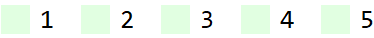 |
This work is licensed under a Creative Commons Attribution 4.0 International License