Wolfram Function Repository
Instant-use add-on functions for the Wolfram Language
Function Repository Resource:
A control for cyclical data, such as angles or direction
ResourceFunction["CircularSlider"][x] represents a control that returns the dynamic variable x, over the range {0,360}. | |
ResourceFunction["CircularSlider"][x,max] represents a control that returns the dynamic variable x, over the range {0,max}. | |
ResourceFunction["CircularSlider"][x,max,dx] represents a control that returns the dynamic variable x, over the range {0,max} with a step size dx. |
| "Start" | "Top" | sets the 0 point, and can take the values "Top", "Right", "Bottom", "Left" |
| "Direction" | "CW" | sets the direction for increasing values: "CW", "CCW" or "ACW" |
| "ControlColor" | Red | sets the color of the control knob |
| "Background" | ThemeColor["Background"] | sets the background color. Use None for a transparent background |
| "TrackColor" | LightYellow | sets the color inside the track |
| "ShowValueQ" | True | when True, shows the value of the slider in the center. |
| "Size" | 150 | sets the size of the control. It must be ≥ 0. Tiny,Small,Medium, or Large is also accepted. |
The default circular slider starts at the top and goes from 0 to 360 in the clockwise direction:
| In[1]:= | ![DynamicModule[{deg = 0}, ResourceFunction["CircularSlider"][deg]]](https://www.wolframcloud.com/obj/resourcesystem/images/2c8/2c867c50-e3c6-4a6a-9a78-a1d43aa85687/2e6af99022ceeb8a.png) |
| Out[1]= | 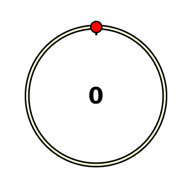 |
Use only integer values, for example, using the dx parameter:
| In[2]:= | ![DynamicModule[{deg = 0}, ResourceFunction["CircularSlider"][deg, 100, 1]]](https://www.wolframcloud.com/obj/resourcesystem/images/2c8/2c867c50-e3c6-4a6a-9a78-a1d43aa85687/45c194e4f15cdda4.png) |
| Out[2]= | 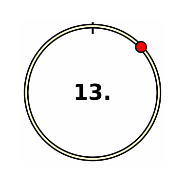 |
Use an angle in radians. 0 is to the right, the direction is counter-clockwise, and the range is 0 to 2π:
| In[3]:= | ![DynamicModule[{deg = 0}, {ResourceFunction["CircularSlider"][deg, 2 \[Pi], 0, "ControlColor" -> Green, "Start" -> "Right", "Direction" -> "CCW"], Dynamic[deg]}]](https://www.wolframcloud.com/obj/resourcesystem/images/2c8/2c867c50-e3c6-4a6a-9a78-a1d43aa85687/6423cccc3773a7f8.png) |
| Out[3]= | 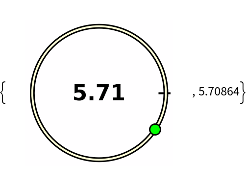 |
Control the position of the start using "Start":
| In[4]:= | ![Table[Column[{DynamicModule[{deg = 30}, ResourceFunction["CircularSlider"][deg, "Start" -> i, "Size" -> Small]], i}, Center], {i, {"Top", "Right", "Bottom", "Left"}}] // Row](https://www.wolframcloud.com/obj/resourcesystem/images/2c8/2c867c50-e3c6-4a6a-9a78-a1d43aa85687/095715820e0cc210.png) |
| Out[4]= | 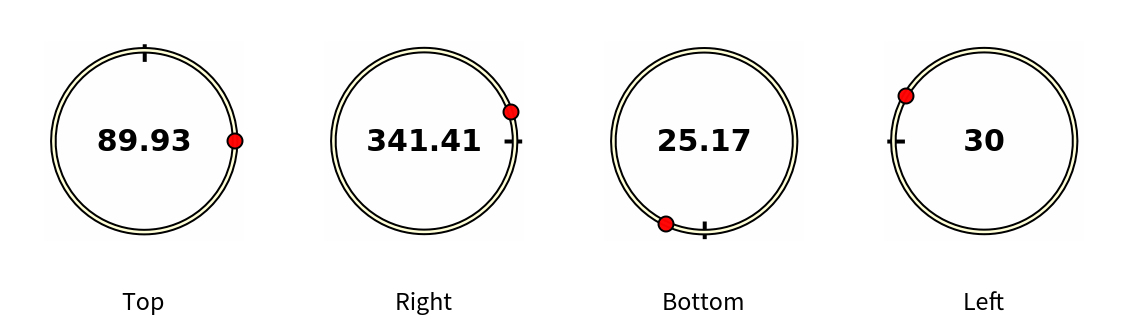 |
Control the direction using "Direction":
| In[5]:= | ![Table[Column[{DynamicModule[{deg = 0}, ResourceFunction["CircularSlider"][deg, "Direction" -> i, "Size" -> Small]], i}, Center], {i, {"CW", "CCW", "ACW"}}] // Row](https://www.wolframcloud.com/obj/resourcesystem/images/2c8/2c867c50-e3c6-4a6a-9a78-a1d43aa85687/2c77d20df8c62f4f.png) |
| Out[5]= | 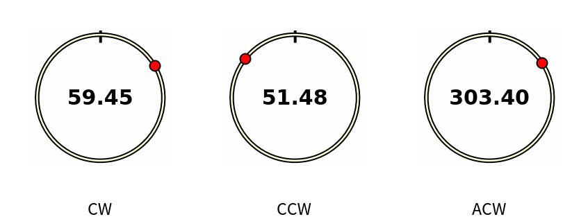 |
By default, the widget works in light and dark mode automatically. If you select your own background color, the color of the text and 0-indicator are adjusted automatically:
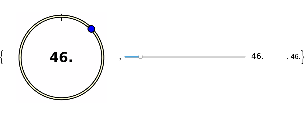
| In[6]:= | ![DynamicModule[{deg = 45.}, ResourceFunction["CircularSlider"][deg, 360, 1, "ControlColor" -> Blue, "Background" -> Red ]]](https://www.wolframcloud.com/obj/resourcesystem/images/2c8/2c867c50-e3c6-4a6a-9a78-a1d43aa85687/7eb196d61c66e92c.png) |
| Out[6]= | 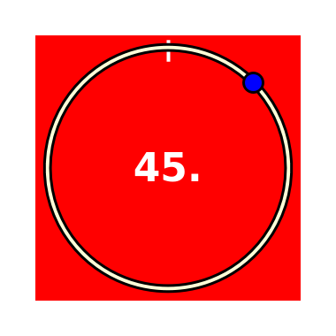 |
If you set the background to None, the existing background is used:
| In[7]:= | ![Panel[DynamicModule[{deg = 135.}, ResourceFunction["CircularSlider"][deg, 360, 1, "ControlColor" -> Blue, "Background" -> None ]], Background -> LightGreen, ImageSize -> {300, 200}]](https://www.wolframcloud.com/obj/resourcesystem/images/2c8/2c867c50-e3c6-4a6a-9a78-a1d43aa85687/1510e2f63014b183.png) |
| Out[7]= | 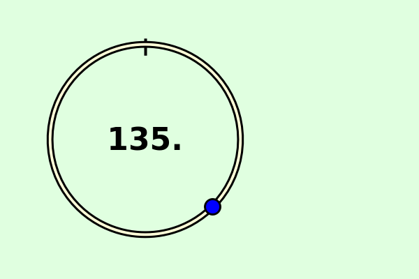 |
Showing the value is optional:
| In[8]:= | ![DynamicModule[{deg = 0}, {ResourceFunction["CircularSlider"][deg, 2 \[Pi], 0, "ShowValueQ" -> False, "Start" -> "Right", "Direction" -> "CCW"], Dynamic[deg]}]](https://www.wolframcloud.com/obj/resourcesystem/images/2c8/2c867c50-e3c6-4a6a-9a78-a1d43aa85687/437208dcb91c397b.png) |
| Out[8]= | 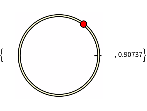 |
This work is licensed under a Creative Commons Attribution 4.0 International License
![DynamicModule[{deg = 45}, {ResourceFunction["CircularSlider"][deg, 360, 1, "ControlColor" -> Blue], Style[Slider[Dynamic[deg], {0, 360, 1}, Appearance -> "Labeled"], ControlsRendering -> Automatic], Dynamic[deg] }]](https://www.wolframcloud.com/obj/resourcesystem/images/2c8/2c867c50-e3c6-4a6a-9a78-a1d43aa85687/6661003dbe3db880.png)