Wolfram Function Repository
Instant-use add-on functions for the Wolfram Language
Function Repository Resource:
Obsolete. Import data about COVID-19 in the US from the COVID Tracking Project
ResourceFunction["COVIDTrackingData"][type] retrieves data of the specified type from the COVID Tracking Project. |
Get the latest five days of national data:
| In[1]:= |
| Out[1]= | 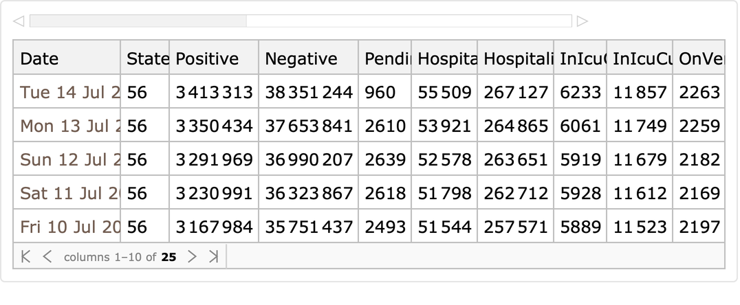 |
Current US data:
| In[2]:= |
| Out[2]= | 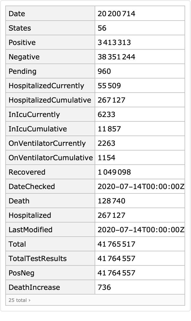 |
Get a sample of daily data on each state:
| In[3]:= |
| Out[3]= | 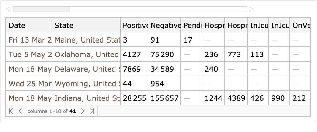 |
Current state data:
| In[4]:= |
| Out[4]= | 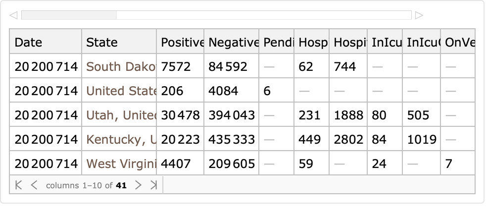 |
Get state information:
| In[5]:= |
| Out[5]= | 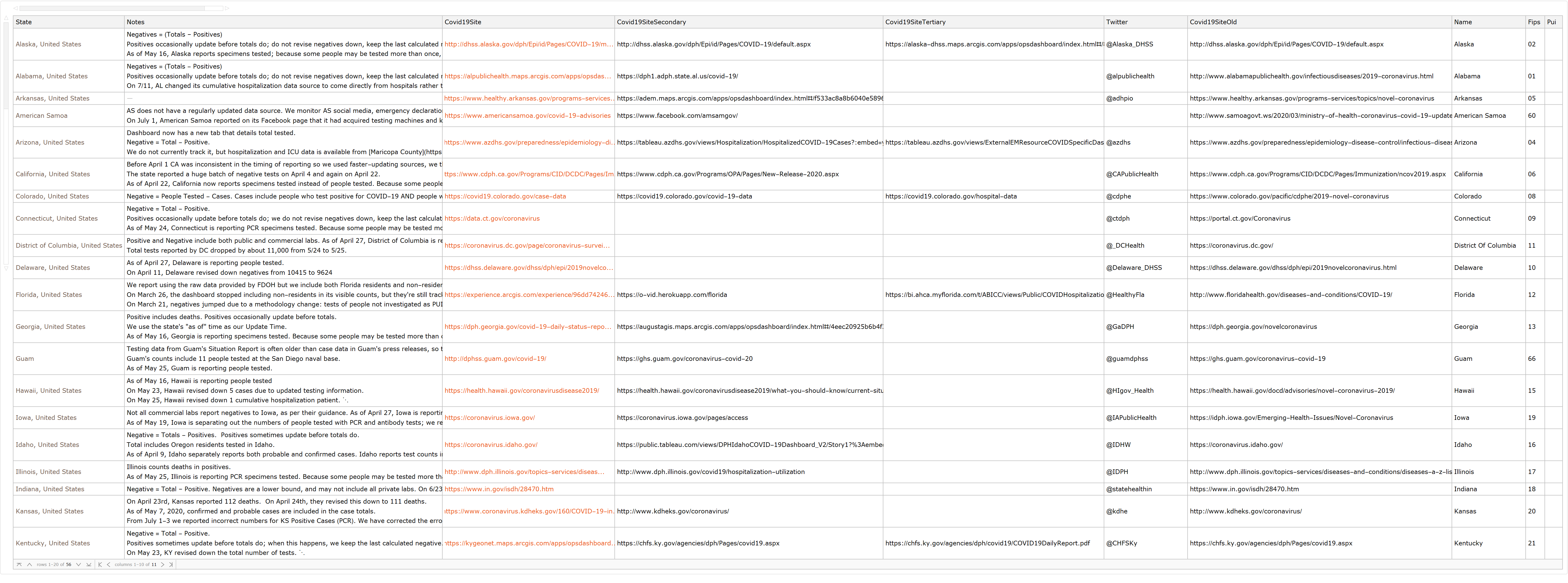 |
Get time series data:
| In[6]:= | ![timeseries = ResourceFunction["COVIDTrackingData"]["StatesDaily"][
GroupBy["State"], AssociationMap[
Function[key, TimeSeries[Lookup[#, key], {Lookup[#, "Date"]}]], {"Positive", "Negative", "Death"}] &];](https://www.wolframcloud.com/obj/resourcesystem/images/1fd/1fdda013-a202-4af1-b989-09e7e4724193/0906331f99380a29.png) |
| In[7]:= |
| Out[7]= | 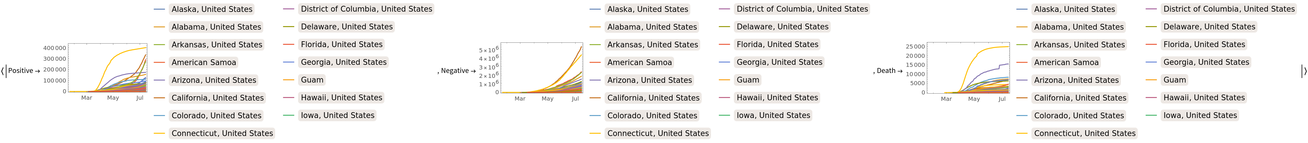 |
Plot the number of hospitalizations in the data:
| In[8]:= |
| Out[8]= | 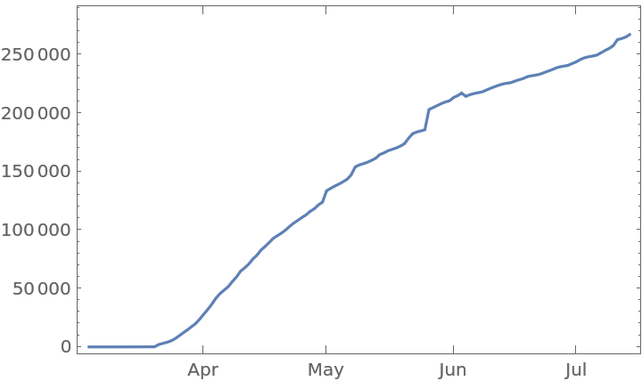 |
Show positive test result counts:
| In[9]:= |
| Out[9]= | 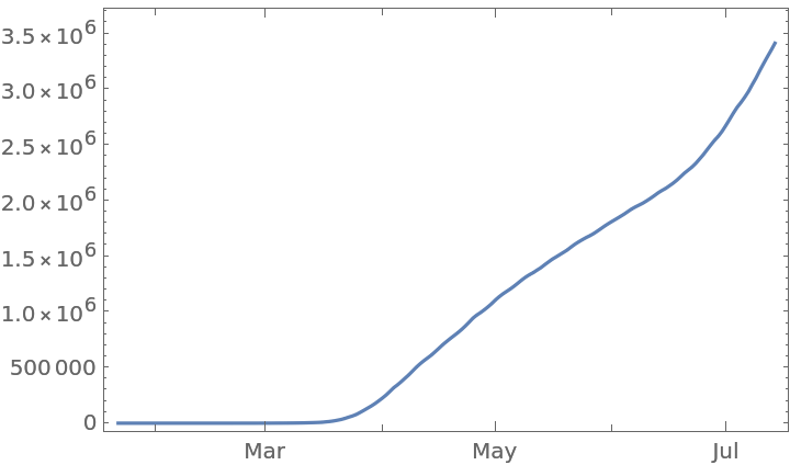 |
For each state, find the most recent date with positive and negative testing results:
| In[10]:= | ![findupdateddata[{___, KeyValuePattern[{"DateChecked" -> dc_, "Death" -> d_, "Positive" -> p1_, "Negative" -> n1_}], KeyValuePattern[{"Positive" -> p2_, "Negative" -> n2_}], ___} /; p1 =!= p2 && n1 =!= n2] := Association @@ {"Positive" -> p1, "Negative" -> n1, "Death" -> d, "DateChecked" -> dc}
findupdateddata[_] := Missing[]](https://www.wolframcloud.com/obj/resourcesystem/images/1fd/1fdda013-a202-4af1-b989-09e7e4724193/2c353c8e6935cd92.png) |
| In[11]:= | ![testingdata = Prepend[DeleteMissing@
ResourceFunction["COVIDTrackingData"][][GroupBy["State"], ReverseSortBy["Date"]/*findupdateddata],
All -> Normal[Append[
KeyDrop[First@ResourceFunction["COVIDTrackingData"]["US"], "States"], "State" -> All]]]](https://www.wolframcloud.com/obj/resourcesystem/images/1fd/1fdda013-a202-4af1-b989-09e7e4724193/4aced001dfc70e3c.png) |
| Out[11]= | 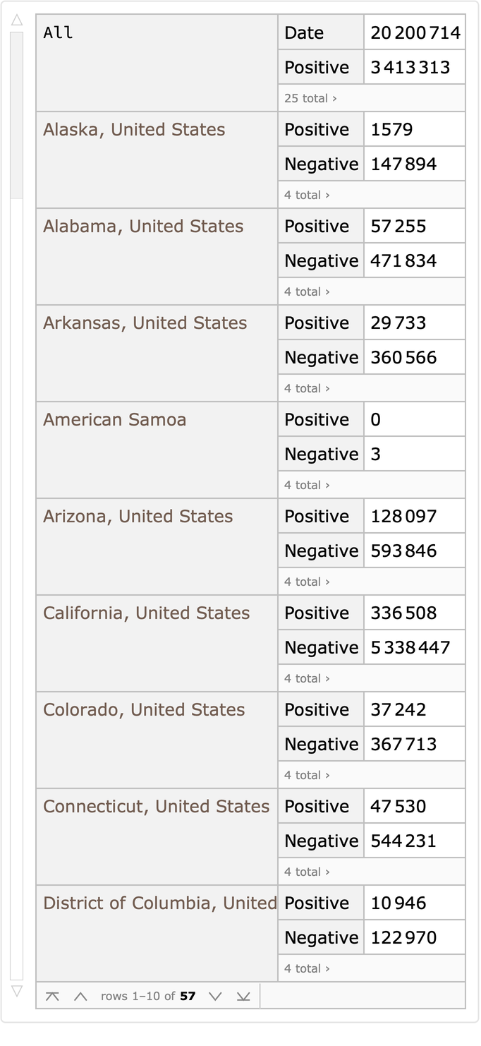 |
See how positive test rates depend on the number of tests:
| In[12]:= | ![testingdata[
DeleteMissing/*(ListLogLinearPlot[#, PlotLabel -> "Positive Test Rate vs Number of Tests Conducted", PlotRange -> Full] &), {(#Positive + #Negative), N[#Positive/(#Positive + #Negative)]} &]](https://www.wolframcloud.com/obj/resourcesystem/images/1fd/1fdda013-a202-4af1-b989-09e7e4724193/581b419e1a419f12.png) |
| Out[12]= | 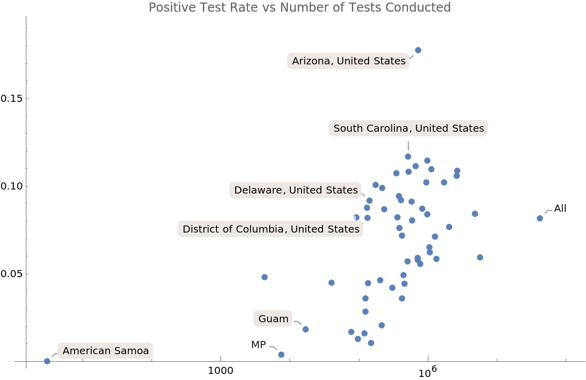 |
See if deaths per positive test are dependent on the amount of testing:
| In[13]:= | ![testingdata[Select[#Positive > 0 &]][
DeleteMissing/*(ListLogLinearPlot[#, PlotLabel -> "Death Rate vs Number of Tests Conducted", PlotRange -> Full] &), {(#Positive + #Negative), N[#Death/(#Positive)]} &]](https://www.wolframcloud.com/obj/resourcesystem/images/1fd/1fdda013-a202-4af1-b989-09e7e4724193/7c17b52d84c17bf3.png) |
| Out[13]= | 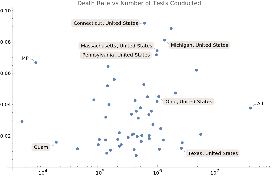 |
See if deaths per positive test are correlated with the positive testing percent:
| In[14]:= | ![testingdata[Select[#Positive > 0 &]][
DeleteMissing/*(ListPlot[#, PlotLabel -> "Death Rate vs Number of Tests Conducted", PlotRange -> Full] &), {N[#Positive/(#Positive + #Negative)], N[#Death/(#Positive)]} &]](https://www.wolframcloud.com/obj/resourcesystem/images/1fd/1fdda013-a202-4af1-b989-09e7e4724193/4898969c0e7a53b0.png) |
| Out[14]= | 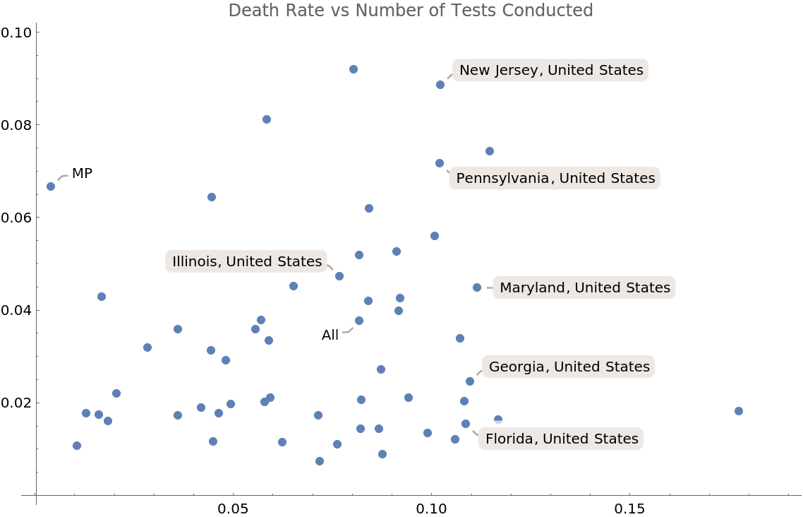 |
Get the new deaths in each state:
| In[15]:= | ![deathsdata = Prepend[
ResourceFunction["COVIDTrackingData"][][GroupBy["State"], SortBy["Date"]/*Select[#Death > 5 &]],
All -> Normal[ResourceFunction["COVIDTrackingData"]["USDaily"][
Select[! MissingQ[#Death] &]/*SortBy["Date"]]
]][Select[Length[#] > 0 &]]](https://www.wolframcloud.com/obj/resourcesystem/images/1fd/1fdda013-a202-4af1-b989-09e7e4724193/3457ceeaa29f7d7a.png) |
| Out[15]= | 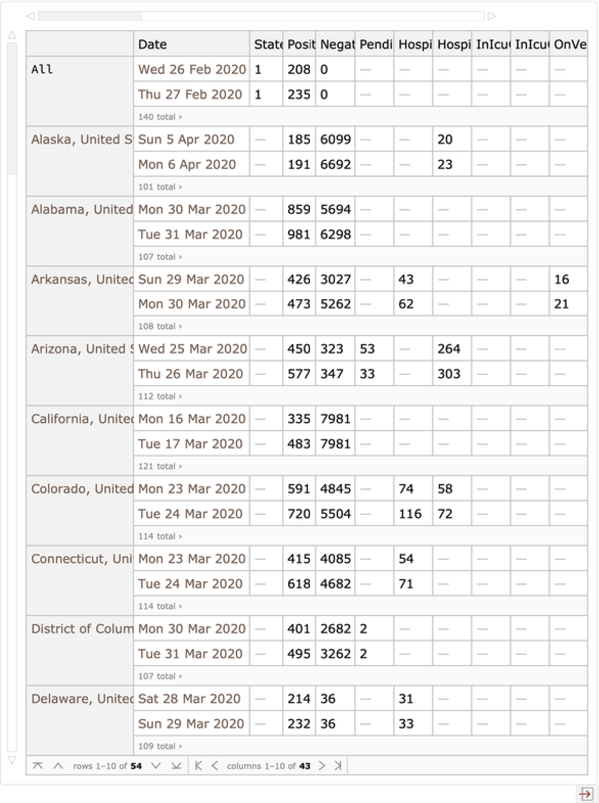 |
Plot the new deaths in each state:
| In[16]:= | ![DateListPlot[
deathsdata[All, TimeSeries[
Transpose[{Most[Lookup[#, "DateChecked"]], Differences[Lookup[#, "Death"]]}]] &][Select[Max[#] > 10 &]], PlotRange -> Full, PlotLabel -> "New Deaths Per State", PlotStyle -> Prepend[Table[Automatic, 50], Directive[Red, Dashed]]]](https://www.wolframcloud.com/obj/resourcesystem/images/1fd/1fdda013-a202-4af1-b989-09e7e4724193/22e7b34ec483ee64.png) |
| Out[16]= | 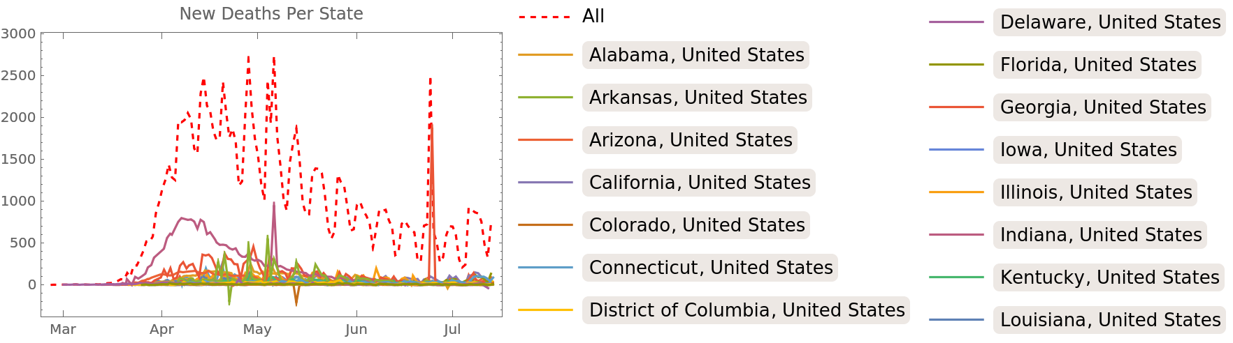 |
Show the smoothed daily proportional increase in deaths in each state:
| In[17]:= | ![DateListPlot[
deathsdata[Select[Last[Lookup[#, "Death"]] > 20 &], MovingAverage[
TimeSeries[
Transpose[{Most[Lookup[#, "DateChecked"]], Ratios[Lookup[#, "Death"]]}]], Quantity[2, "Days"]] &], Sequence[
PlotRange -> {{"March 14", Automatic}, {1, 2}}, PlotLabel -> "Death Increase Ratio Per State", PlotStyle -> Prepend[
Table[Automatic, 50],
Directive[Red,
Thickness[0.01], Dashed]]]]](https://www.wolframcloud.com/obj/resourcesystem/images/1fd/1fdda013-a202-4af1-b989-09e7e4724193/7591353bffcf276c.png) |
| Out[17]= | 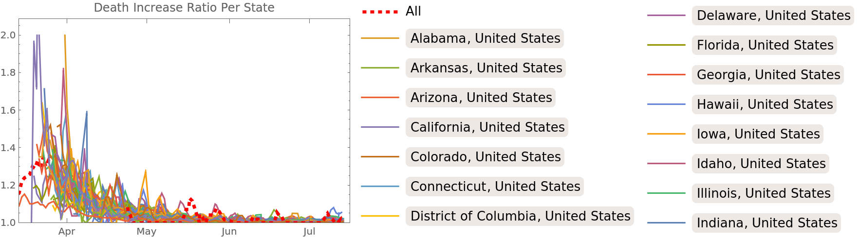 |
This work is licensed under a Creative Commons Attribution 4.0 International License