Wolfram Function Repository
Instant-use add-on functions for the Wolfram Language
Function Repository Resource:
Plot the pairwise mean and difference between two data samples
ResourceFunction["MeanDifferencePlot"][d1, d2] plots the pairwise means against the differences of d1 and d2. |
| "LimitOfAgreement" | 0.95 | value between 0 and 1 representing the range of the limits of agreement |
Create a mean difference plot between two data samples:
| In[1]:= |
| Out[1]= | 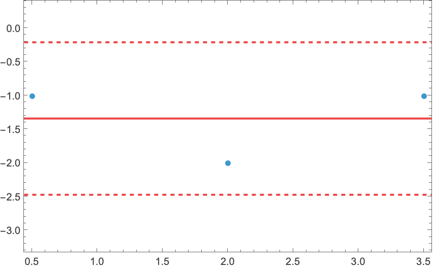 |
A more complex mean difference plot between two data samples:
| In[2]:= |
| Out[2]= | 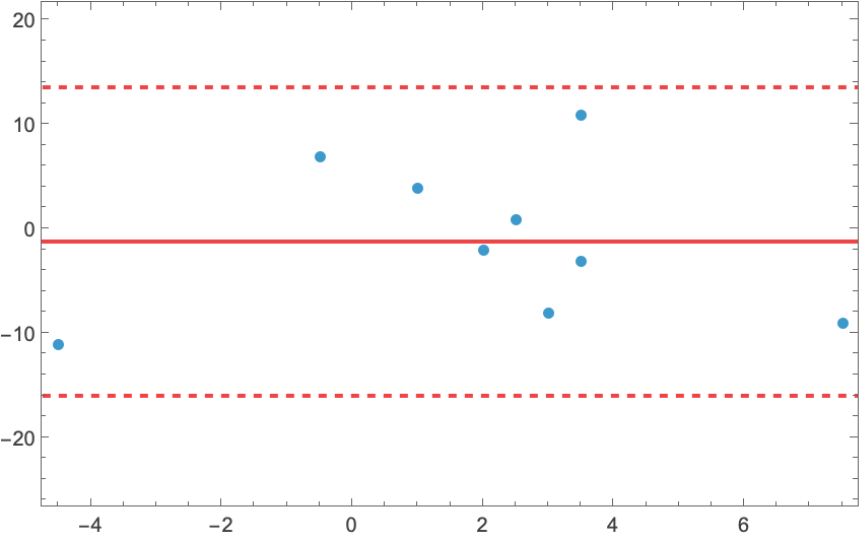 |
Change the upper and lower limits of agreement with the "LimitOfAgreement" option:
| In[3]:= | ![d1 = RandomReal[{-10, 10}, 100];
d2 = d1 + RandomReal[{1, 10}, 100];
GraphicsRow[
ResourceFunction["MeanDifferencePlot"][d1, d2, "LimitOfAgreement" -> #] & /@ {0.2, 0.6, 0.9}]](https://www.wolframcloud.com/obj/resourcesystem/images/75b/75b6c32e-95cf-4907-939a-e02e731fcd6e/1d227db35d6057cb.png) |
| Out[5]= | 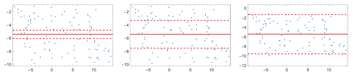 |
Consider the case of two datasets containing glucose level readings for two different measurement methods:
| In[6]:= |  |
MeanDifferencePlot shows the agreement between readings of the two methods:
| In[7]:= |
| Out[7]= | 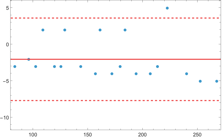 |
A negative bias shows that the second method reads lower glucose values that the first method on average.
Data samples must have the same length:
| In[8]:= |
| Out[8]= |
Wolfram Language 13.0 (December 2021) or above
This work is licensed under a Creative Commons Attribution 4.0 International License